Q3 2021
A gentle introduction to machine teaching
What is machine teaching?
Despite its widespread popularity, AI still has yet to pay off for more than 10% of companies that have adopted it. According to the MIT Sloan study, to properly reap benefits from AI - organizations must find ways to bring humans and machines closer together, a concept they call "organizational learning." Concretely, when most enterprises start adopting AI strategies, the first set of use cases targeted are the lowest hanging fruits. These are typically problems where the data is readily available and in a form where a model can be easily trained (e.g. customer support triage, social media sentiment analysis, customer segmentation for marketing), but are rarely the highest value use case in the organization. When thinking about where AI can provide the most value, typically the most successful enterprises focus on augmenting subject matter experts.
This poses a problem for most organizations, as applying AI to augment domain experts requires those very same experts to be involved in training those models. For example, a large healthcare organization might target one of their highest value use cases: building an AI to help diagnose a few specific cancer strains. For the AI to be able to complete the task, it must be trained on hundreds of thousands of well-labeled examples produced by experts like oncologists and radiologists. This process is cost-prohibitive for most organizations, as experts are scarce resources and can't be diverted to labeling data full time for months on end. "Organizational learning" makes room for experts and machines to not only work together but also learn from each other over time, and the team at MIT that conducted the survey indicate that this mutual learning between human and machine is essential to success with AI. Doing this right, however, is difficult as it increases the demand on already scarce subject matter experts without ever addressing the core issue: there are not enough experts in an organization to have them both label data and perform their typical day to day tasks.
Machine Teaching, a field of study that has been gaining popularity recently, is focused on addressing the bottleneck of domain expertise in AI. While classical Machine Learning (ML) research focuses on optimizing the learning algorithm or network architecture, Machine Teaching (MT) focuses on making the human more effective at teaching the model. While a "smarter student" (new innovation in model architectures) could learn the expert's context faster and with fewer examples than the "average student", these types of innovations are rare and unpredictable. On the other hand, a more effective "teacher" (a single domain expert doing the work of hundreds) can have an outsized impact in practically any AI/ML context regardless of how sophisticated the "student" is.
While the expertise bottleneck is by far the biggest limiting factor currently facing AI/ML implementations today, there are other major obstacles in the current ML workflow that prevent organizations from seeing value come back from their investments. Productivity for ML scientists is lower than it could be as the ML workflow is inherently disjointed and often rife with debt. It is near impossible to stay agile in the face of model drift, as drifting models require fresh data for retraining - constantly draining time from expert labelers to maintain legacy pipelines. Finally, current ML processes don't lend themselves naturally to explainability - what happens when your training set is biased but you can't ask your labelers why their labels were biased (because there are too many labelers, no record of which labelers produced a set of labels, or they are no longer part of the organization)?
Productivity
Software engineers have long touted the importance of “flow state” when programming, but this concept is missing in data science workflows. For instance, before you’re even able to start building a model, you first need labeled data to dig into. Once a project is defined, you may have to wait weeks for data to be annotated. This labeling process is the slowest part of the workflow, yet you can do nothing until it’s completed.
“You’re never done labeling” is a common expression muttered angrily by ML experts. Even after your model is built and deployed, the labeling never ends. Models don’t stay static forever - their performance degrades over time due to changes in the environment (which is called drift). Typically, models are retrained periodically to counteract the effects of drift - but how do you measure the model drift itself? You could track statistical measures (e.g. Kullback-Leibler divergence, Jensen-Shannon divergence, or the Kolmogorov-Smirnov test) for your input and output spaces, but these statistics are difficult to interpret without having concrete labeled data to reference. Ideally, you would assess model performance in production the same way you would during development - by looking at metrics like precision, accuracy, recall, etc. but all of these measures are comparisons between predictions of the model and a labeled baseline. In your development environment you would use your validation set as the baseline, but in production the only way you can generate a baseline is by labeling a sample of your production traffic periodically. This process is difficult to scale, as each production model would require a constant ongoing investment of human effort for maintenance.
Simply put, labeling is the most frequently re-visited step in the workflow and causes compounding slowdowns throughout the process. Since labeling takes time when performed manually, the current ML workflow is discontinuous and doesn’t lend itself well to flow states.
Agility
What happens when the concept of what you are trying to predict changes? For example, if you’re building a classifier for personally identifiable information (PII) based on rules or regulations, what happens when those regulations change and include a brand new type of PII?
What about when the input space shifts? For example, let’s imagine you work in the data science team of a popular email service, and your team manages a model that detects spam for all of your users. Your team worked diligently to build a model that takes many features into consideration, and it did a great job of finding spammers. Over time, however, you notice that the model’s performance degrades and false positives/negatives start piling up. It’s possible that your users’ behaviors have changed - maybe your users like your email client so much that they’re emailing much more frequently than they did before. Maybe spammers are making changes to their tactics to make prediction much harder.
To overcome both of these issues, you would need to relabel data and retrain your models, but how often should that be done? How early do you need to start creating training data? The relabeling and retraining process takes weeks of work, delaying the speed with which organizations can adapt to changes. For acute changes in the world (like when COVID-19 became widespread), being able to react quickly is key and is not currently something that ML workflows are currently well adapted for.
Explainability
Explainability in model development pipelines is something that most Machine Learning practitioners can likely appreciate. There are various ways to provide explainability at the model level - for instance, by using Shapley Values or by using an inherently interpretable model to begin with, but bias is typically introduced in the training data itself. If labelers hold biases or if the way the data was sampled introduces some skew, models tend to pick these up. Using the plethora of methods to achieve model explainability, we can diagnose model biases and find issues in the training data - but how do we explain the labels in the data?
As useful as it is to point to bias and skew in the data, it's more helpful to be able to get to the why - why did the labelers indicate that this particularly hateful tweet isn't toxic? Why did the labelers mislabel this credit application from a minority? Currently, the only way to get this level of explainability is to physically ask the labelers why they applied a particular label - but it's impossible to do this well. Labeling teams see churn, labelers may not be paying full attention because they're trying to get through the task quickly, and labelers sometimes just make mistakes. All of these factors make it difficult to nail down the root causes of poor labels, and ultimately prevent data teams from quickly fixing problems with their models.
Use case coverage
As mentioned earlier, the biggest reason why most enterprises don't see value come back from their investments in AI is that their highest value use cases are massive time sinks for their subject matter experts. Today, the most impactful ML/AI solutions are typically considered too difficult or expensive to even attempt due to labeling the data. For example, if you wanted to build a model to detect a specific type of cancer in MRI images - you would need an army of radiologists and oncologists on staff to provide their expertise in the form of labeled data. There's no doubt that this model would be incredibly valuable if built, so the argument for building the model is straightforward from an impact standpoint. However, an organization might only have a handful of these experts, and their time is too valuable to spend on data labeling. As a result, the business case is dead in the water despite the apparent value the project would bring to the table should it be successful.
Every vertical suffers from this issue - subject matter expertise is expensive, therefore the most valuable models are difficult or impossible to justify building. The easiest to build models are rarely the most helpful, and so many organizations end up spinning their wheels trying to get AI to provide meaningful impact.
Properties of machine teaching solutions
By shifting the focus to making machine teachers more effective, we can more effectively target the human bottleneck in the workflow and solve for all four of the above problems. An effective machine-teaching solution requires the following attributes to lower the costs introduced by human effort significantly:
- Simple data exploration
Domain experts should easily traverse their data to help them discover patterns and elicit their knowledge.
2. Expressive interfaces to capture knowledge and context
As the domain experts interact with the data, they should capture patterns and context that they may have come across. For example, a user might want to define a regex or another function that roughly approximates the shape of data that a particular label belongs to.
3. Tight feedback loops
While working, the domain experts should be getting guidance from the platform on how they can be using their time most effectively. This guidance may come as feedback about the patterns they've come across so far, or as recommendations from the platform about where they can be spending more time to maximize their impact.
4. Automation as a core pillar
Ultimately, the labelers should only be necessary until the point where the system can take over. The ongoing cost of maintaining a pipeline should be near zero.
5. Explanations and interpretations
Since automation is being leaned upon heavily, a useful machine teaching platform must be entirely explainable. These systems are used to bootstrap and train models that live in production environments, so being able to diagnose "why a label is Y1 instead of Y2" and act on it is vital.
6. Separation of duties between ML experts and domain experts
Sometimes the "Domain Expert" in this case is a machine learning practitioner, but many times it's not. It's essential to separate the two concerns - subject matter experts should focus on providing their subject matter expertise. At the same time, ML practitioners should focus on the actual ML work necessary to learn from that subject matter expertise.
Applying this framework to the problem statements above paints us a good picture of the impact Machine Teaching can have on our existing workflow.
Productivity
- Instead of having an army of labelers, have one or two subject matter experts available as labelers.
- Instead of labeling taking weeks, it can take hours or days, leaning heavily on automation.
Agility
- As environments shift, the cost of adjusting the distilled context in the platform should be negligible. If the definition of a class changes, or if the input space drifts, it should be trivial to adjust the platform to reconcile.
Use case coverage
- Since large numbers of domain experts aren't necessary in a Machine Teaching workflow, it's easy to unlock otherwise cost-prohibitive use cases. Have a single expert spend a few hours bootstrapping the system until the automation starts kicking in. At that point, only spot-checking is necessary to deal with production model drift over time.
Explainability
- Since explainability is a required core feature of Machine teaching platforms, we can get more in-depth explanations than just at the model level. We should easily find incorrect labels and quickly figure out why they are wrong (did someone distill a concept incorrectly? Did the environment shift? Does the platform need more signal to understand the class better?)
Probabilistic machine learning and weak supervision
We recently wrote an essay Hand Labeling Considered Harmful about how subject matter and domain experts can collaborate more productively with machines to label data. For example:
There is a growing area of weak supervision, in which SMEs specify heuristics that the system then uses to make inferences about unlabeled data, the system calculates some potential labels, and then the SME evaluates the labels to determine where more heuristics might need to be added or tweaked. For example, when building a model of whether surgery was necessary based on medical transcripts, the SME may provide the following heuristic: if the transcription contains the term “anaesthesia” (or a regular expression similar to it), then surgery likely occurred.
In this technical article, we demonstrate a proof of principle with respect to how humans can collaborate with machines to label training data and to build machine learning models.
We do this in the context of probabilistic labels and predictions, that is, where our model outputs the probability of whether a particular row has a given label, rather than the label itself. As we made clear in Hand Labeling Considered Harmful, establishing ground truth is rarely trivial, if it's even possible, and probabilistic labels are a generalization of categorical labels that allow us to encode the resulting uncertainty.
We introduce three key figures that a data scientist or subject matter expert (SME) can leverage in order to gauge the performance of probabilistic models and use the performance as encoded by the figures to iterate on the model:
- Base rate distribution,
- Probabilistic confusion matrix, and
- Label prediction distribution.
We demonstrate how such a workflow allows humans and machines to do what they're best at. In brief, these figures act as guides for the SME:
- The base rate distribution encodes our uncertainty around the class balance and will be a useful tool as we want our predicted labels to respect the base rate in the data;
- When we have categorical labels, we use a confusion matrix to gauge model performance; now that we have probabilistic labels, we introduce a generalized probabilistic confusion matrix to gauge model performance;
- The label prediction distribution plot shows us the entire distribution of our probabilistic predictions; as we'll see, it is key that this distribution respects what we know about our base rate (for example, if our base rate for 'Surgery' in the above is 25%, in the label distribution we would expect to see ~25% of our dataset with a high chance of being surgery and ~75% of it with a low chance of being surgery.)
Let's now get to work! The steps we'll go through are:
- To hand label a small amount of data and establish a base rate;
- Build some domain-informed heuristics/hinters;
- Gauge our model performance by looking at the probabilistic confusion matrix and the label distribution plot;
- Build more hinters in order to improve the quality of our labels.
You can find all the relevant code in this Github repository.
So let's get labeling!
Hand labels and base rates
The first step in the workflow is to hand label a small sample of the data. The data we'll be working with here is the medical transcriptions dataset from Kaggle and the task is to predict whether any given transcription involved surgery, as given in the 'medical specialty' column. We'll use this column to hand label several rows, for pedagogical purposes, but this will usually be an SME looking through the transcription to label the rows. Let's jump in and have a look at our data:
# import packages and data
import numpy as np
import pandas as pd
import matplotlib.pyplot as plt
import seaborn as sns
import warnings; warnings.simplefilter('ignore')
sns.set()
df = pd.read_csv('data/mtsamples.csv')
df.head()
Having checked out our data, let's now hand label some rows, using the 'medical_specialty' column:
# hand label some rows
N = 250
df = df.sample(frac=1, random_state=42).reset_index()
df_labeled = df.iloc[:N]
df_unlabeled = df.iloc[N:]
df_labeled['label'] = (df_labeled['medical_specialty'].str.contains('Surgery') == 1).astype(int)
df_unlabeled['label'] = None
df_labeled.head()
These acts of hand labeling serve two purposes:
- to teach us about the class balance and base rate
- to create a validation set
When building our model, it will be key to make sure that the model at least approximately respects the class balance, as encoded in the base rate of these hand labels, so let's calculate the base rate now.
base_rate = sum(df_labeled['label'])/len(df_labeled)
f"Base rate = {base_rate}"'Base rate = 0.24'The base rate distribution
It's now time to introduce the first key figure: the base rate distribution. What do we mean by "distribution" here, given that we have an actual base rate? Well, one way to think about it is that we've calculated the base rate from a sample of the data. This means that we don't know the exact base rate and our uncertainty around it can be characterized by a distribution. One technical way to formulate this uncertainty is using Bayesian techniques and, essentially, our knowledge about the base rate is encoded by the posterior distribution.
You don't need to know too much about Bayesian methods to get the gist of this, but if you'd like to know more, you can check out some introductory material here. In the notebook, we have written a function that plots the base rate distribution and we then plot the distribution for the data we hand labeled above (an eagle will notice that we’ve scaled our probability distribution so that it has a peak at y=1; we’ve done so for pedagogical purposes and all relative probabilities remain the same).
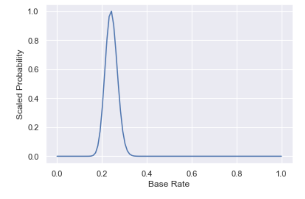
First, note that the peak of the distribution is at the base rate we calculated, meaning that this is the most likely base rate. However, the spread in the distribution also captures our uncertainty around the base rate.
It is essential to keep an eye on this figure as we iterate on our model, as any model will need to predict a base rate that is close to the peak of the base rate distribution.
Note that:
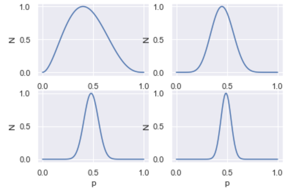
- As you generate more and more data, your posterior gets narrower, i.e. you get more and more certain of your estimate.
- You need more data to be certain of your estimate when p=0.5, as opposed to when p=0 or p=1.
Below, we have plotted the base rate distributions of p=0.5 and increasing N (N=5, 20, 50, 100). In the notebook, you can build an interactive figure with a widget!
Machine labeling with domain hinters
Having hand labeled a subset of the data and calculated the base rate, it's time to get the machine to do some probabilistic labeling for us, using some domain expertise.
A doctor, for example, may know that, if the transcription includes the term 'ANESTHESIA', then it's quite likely that surgery occurred. This type of knowledge, once encoded for computation, is known as a hinter.
We can use this information to build a model in several ways, including building a generative model, which we'll do soon. For simplicity's sake, as a first approximation we'll update the probabilistic labels by:
- Increasing P(Surgery) from the base rate if the transcription includes the term 'ANESTHESIA' and
- doing nothing if it doesn't (we're assuming that the absence of the term provides no signal here).
There are many ways to increase P(Surgery) and, for simplicity, we take the average of the current P(Surgery) and a weight W (the weight is usually specified by the SME and encodes how confident they are that the hinter is correlated with positive results).
# Combine labeled and unlabeled to retrieve our entire dataset
df1 = pd.concat([df_labeled, df_unlabeled])
# Check out how many rows contain the term of interest
df1['transcription'].str.contains('ANESTHESIA').sum()1319# Create column to encode hinter result
df1['h1'] = df1['transcription'].str.contains('ANESTHESIA')
## Hinter will alter P(S): 1st approx. if row is +ve wrt hinter, take average; if row is -ve, do nothing
## OR: if row is +ve, take average of P(S) and weight; if row is -ve
##
## Update P(S) as follows
## If h1 is false, do nothing
## If h1 is true, take average of P(S) and weight (95), unless labeled
W = 0.95
L = []
for index, row in df1.iterrows():
if df1.iloc[index]['h1']:
P1 = (base_rate + W)/2
L.append(P1)
else:
P1 = base_rate
L.append(P1)
df1['P1'] = L
# Check out what our probabilistic labels look like
df1.P1.value_counts()0.240 3647
0.595 1352
Name: P1, dtype: int64Now that we've updated our model using a hinter, let's drill down into how our model is performing. The two most important things to check are:
- How our probabilistic predictions match up with our hand labels and
- How our label distribution matches up with what we know about the base rate.
For the former question, enter the probabilistic confusion matrix.
The probabilistic confusion matrix
In a classical confusion matrix, one axis is your hand labels and the other access is the model prediction.
In a probabilistic confusion matrix, your y axis is your hand labels and the x axis is model prediction. But in this case, the model prediction is a probability, as opposed to 'yes' or 'no', in the classical confusion matrix.
plt.subplot(1, 2, 1)
df1[df1.label == 1].P1.hist();
plt.xlabel("Probabilistic label")
plt.ylabel("Count")
plt.title("Hand Labeled 'Surgery'")
plt.subplot(1, 2, 2)
df1[df1.label == 0].P1.hist();
plt.xlabel("Probabilistic label");
plt.title("Hand Labeled 'Not Surgery'");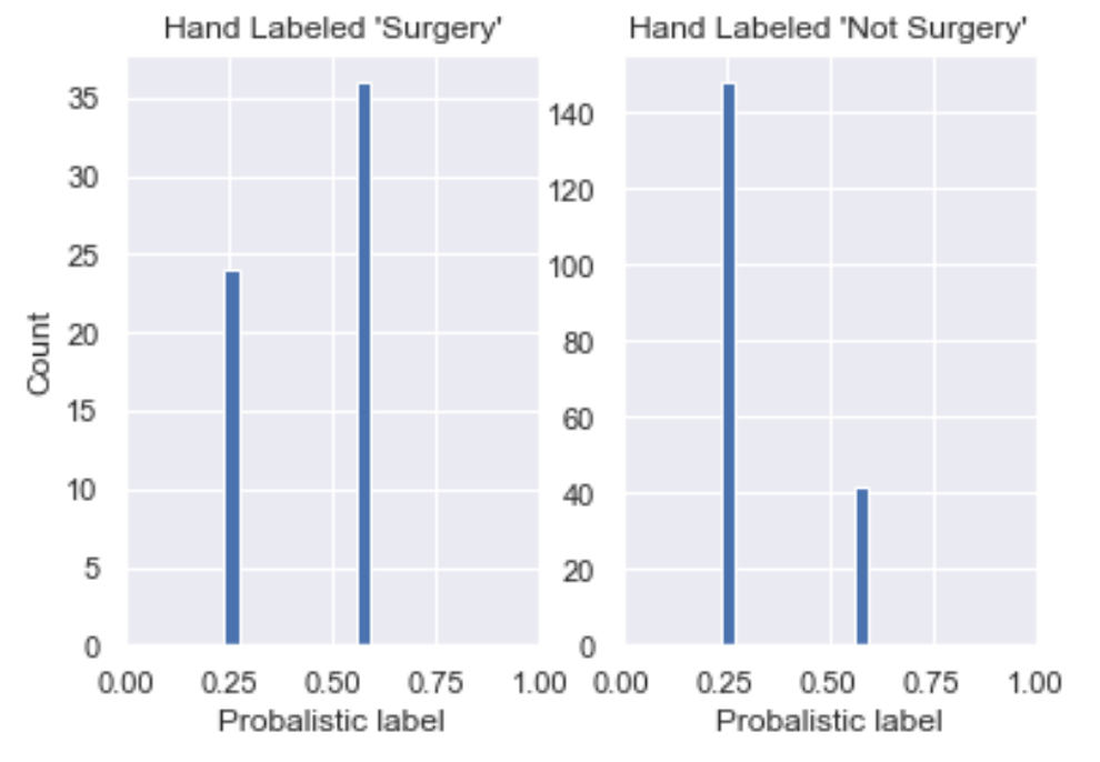
We see here that:
- The majority of data labeled 'Surgery' has P(S) around 0.60 (though not by much) and the rest around 0.24;
- All rows hand labeled 'Not Surgery' have P(S) around 0.24 and the rest around 0.60.
This is a good start, in that P(S) is skewed to the left for those labeled 'Not Surgery' and to the right for those labeled 'Surgery'. However, we would want it skewed far closer to P(S) = 1 for those labeled Surgery so there's still work to be done.
Label distribution plot
The next key plot is the label prediction distribution plot across the dataset: we want to see how our label predictions are distributed and whether this matches up to what we know of our base rate. For example, in our case, we know that our base rate is likely somewhere around 25%. So what we would expect to see in the label distribution is ~25% of our dataset with a near 100% chance of being surgery and ~75% of it with a low chance of being surgery.
df1.P1.plot.kde();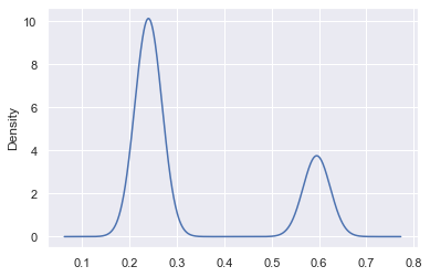
We see peaks at ~25% and ~60%, which means that our model really doesn't yet have a strong sense of the label and so we want to add more hinters.
Essentially, we'd really like to see our probabilistic predictions closer to 0 and 1, in a proportion that respects the base rate.
Building more hinters
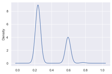
To build better labels, we can inject more domain expertise by adding more hinters. We do this below by adding two more positive hinters (ones that are correlated with 'Surgery'), which alter our predicted probability in a manner analogous to the hinter above. See the notebook for the code. Here are the probabilistic confusion matrix and the label distribution plot:
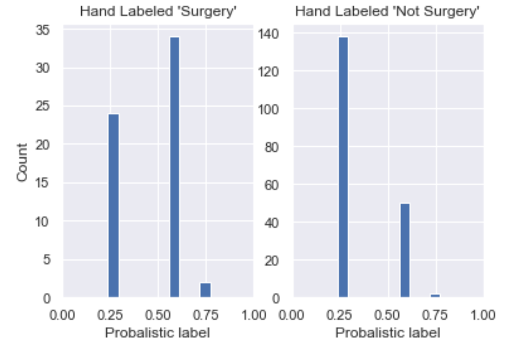
Two things have happened, as we increased our number of hinters:
- In our probabilistic confusion matrix, we've seen the histogram for those hand labeled 'Surgery' move to the right, which is good! We've also seen the histogram for hand labeled 'Surgery' move slightly to the right, which we don't want. Note that this is because we have only introduced positive hinters so we may want to introduce negative hinters next or use a more sophisticated method of moving from hinter to probabilistic labels.
- Our label distribution plot now has more density above P(S) = 0.5 (more density on the right), which is also desirable. Recall what we would expect to see in the label distribution is ~25% of our dataset with a near 100% chance of being surgery and ~75% of it with a low chance of being surgery.
Generative models for hinters
Such hinters, although instructive as toy examples, can only be so performant. Let's now use a larger set of hinters to see if we can build better training data.
We'll also use a more sophisticated method of moving from hinter to probabilistic label: instead of averaging over a weight and previous probabilistic prediction, we'll use a Naive Bayes model, which is a generative model. A generative model is one that models the _joint probability_ P(X,Y) of features X and target Y, in contrast to discriminative models that model the conditional probability P(Y|X) of the target conditional on the features. A strength of using a generative model, as opposed to a discriminative model like a random forest, is that it allows us to model the complex relationships between the data, the target variable, and the hinters: it allows us to answer questions such as "Which hinters are noisier than the others?" and "In which cases are they noisy?" For more on generative models, Google has a nice introduction here.
To do this, we create arrays that encode whether or not a hinter is present, for any given row. First, let's create lists of positive and negative hinters:
# List of positive hinters
pos_hinters = ['anesthesia', 'subcuticular', 'sponge', 'retracted', 'monocryl', 'epinephrine',
       	'suite', 'secured', 'nylon', 'blunt dissection', 'irrigation', 'cautery', 'extubated',
       	'awakened', 'lithotomy', 'incised', 'silk', 'xylocaine', 'layers', 'grasped', 'gauge',
       	'fluoroscopy', 'suctioned', 'betadine', 'infiltrated', 'balloon', 'clamped']
# List of negative hinters
neg_hinters = ['reflexes', 'pupils', 'married', 'cyanosis', 'clubbing', 'normocephalic', 'diarrhea', 'chills', 'subjective']For each hinter, we now create a column in the DataFrame encoding whether the term is in the transcription of that row:
for hinter in pos_hinters:
	df1[hinter] = df1['transcription'].str.contains(hinter, na=0).astype(int)
	# print(df1[hinter].sum())
for hinter in neg_hinters:
	df1[hinter] = -df1['transcription'].str.contains(hinter, na=0).astype(int)
# print(df1[hinter].sum())We now convert the labeled data into NumPy arrays and split it into training and validation sets, in order to train our probabilistic predictions on the former and test them on the latter (note we're currently using only positive hinters).
# extract labeled data
df_lab = df1[~df1['label'].isnull()]
#df_lab.info()
# convert to numpy arrays
X = df_lab[pos_hinters].to_numpy()
y = df_lab['label'].to_numpy().astype(int)
## split into training and validation sets
from sklearn.model_selection import train_test_split
X_train, X_test, y_train, y_test = train_test_split(
X, y, test_size=0.33, random_state=42)We now train a Bernoulli (or Binary) Naive Bayes algorithm on the training data:
# Time to Naive Bayes that shit!
from sklearn.naive_bayes import BernoulliNB
clf = BernoulliNB(class_prior=[base_rate, 1-base_rate])
clf.fit(X_train, y_train);With this trained model, let's now make our probabilistic prediction on our validation (or test) set and visualize our probabilistic confusion matrix to compare our predictions with our hand labels:
probs_test = clf.predict_proba(X_test)
df_val = pd.DataFrame({'label': y_test, 'pred': probs_test[:,1]})
plt.subplot(1, 2, 1)
df_val[df_val.label == 1].pred.hist();
plt.xlabel("Probabilistic label")
plt.ylabel("Count")
plt.title("Hand Labeled 'Surgery'")
plt.subplot(1, 2, 2)
df_val[df_val.label == 0].pred.hist();
plt.xlabel("Probabilistic label")
plt.title("Hand Labeled 'Not Surgery'");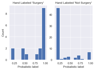
This is cool! Using more hinters and a Naive Bayes model, we see that we've managed to increase the number of true positives _and_ true negatives. This is visible in the plots above as the histogram for the hand label 'Surgery' is skewed more to the right and the histogram for 'Not Surgery' to the left.
Now let's plot the entire label distribution plot (to be technically correct, we would need to truncate this KDE at x=0 and x=1 but, for pedagogical purposes we’re fine as this wouldn’t change a great deal):
probs_all = clf.predict_proba(df1[pos_hinters].to_numpy())
df1['pred'] = probs_all[:,1]
df1.pred.plot.kde();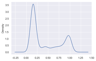
When to stop labeling
If you're asking "When is it time to stop labeling?", you're asking a key and fundamentally hard question. Let's decouple this into two questions:
- When do you stop hand labeling?
- When do you stop the whole process? I.e. When do you stop creating hinters?
To answer the first, at a bare minimum, you stop hand labeling when your base rates are calibrated (one way to think about this is when your base rate distribution stops jumping around). Like a lot of ML, this is in many ways more of an art than a science! Another way to think of this would be to plot a learning curve of base rate against size of labeled data and stop once it plateaus. Another important factor in considering when you’re done hand labeling is when you feel that you’ve achieved a statistically significant baseline so that you can determine how good your programmatic labels are.
Now when do you stop adding hinters? This is analogous to asking "When are you confident enough to start training a model on this data?" and the answer will vary from scientist to scientist. You could do it qualitatively by scrolling through and eyeballing but most scientists would prefer a quantitative method. The easiest way is to calculate metrics such as accuracy, precision, recall, and F1 score of your probabilistically-labeled data against your hand-labeled data and the lowest lift way of doing this is by using a threshold for your probabilistic labels: for example, a label of < 10% would be 0, > 90% 1, and anything in between abstention. To be clear, such questions are also still active areas of research at Watchful... Watch this space!
Many thanks to Eric Ma for his feedback on a working draft of this post.